

Overview
A price chart is a compact record of what traded, when it traded, and over what price range it traded. In common chart formats such as candlesticks and bars, each bar shows the open, high, low, and close for a chosen interval.
The safest way to read a chart is to start with observation, not prediction. First identify the timeframe. Then ask whether price is mostly rising, mostly falling, or rotating within a bounded area. Only after that does it make sense to mark support, resistance, and any breakout attempt.
This matters because charts are easy to narrate after the fact. A structured reading process helps reduce hindsight driven storytelling by forcing you to describe what is visible before you interpret it.
Volume can add useful context, but only if you understand what the chart is actually showing. Depending on the market, venue, and data provider, volume may represent traded contracts, consolidated trade data, tick volume, or in some cases no usable volume at all.
The goal is modest and useful: read what the chart is showing now, define what would weaken that reading, and avoid turning patterns into promises.
Scope and assumptions
This article is a beginner guide to reading a price chart using approved exchange, regulator, and platform research only.
It focuses on a practical reading loop: choose chart type and timeframe, read price structure from left to right, mark support and resistance zones, check whether price is near a boundary or in the middle, use volume as context, and define invalidation before making a strong claim.
Support and resistance are treated as zones rather than exact lines because repeated reactions rarely occur at precisely the same price.
Volume is handled carefully because its meaning can differ across futures, equities, and platform feeds, and some charts may show tick volume or no trade volume.
This article does not treat chart patterns as guarantees. Technical analysis is an approach to examining price, rate of change, volume, and related fields, not proof that a market must move in a particular way.
Main narrative
If you want to read a price chart without fooling yourself, begin with a simple idea: a chart is a record, not a prophecy. It shows what traded, when it traded, and the price range covered by each bar. Candlestick and bar charts both show open, high, low, and close for a chosen interval, and that interval is your first important choice.
Start by choosing the chart type and timeframe. A candlestick or bar chart is usually the clearest place to begin because each bar contains the core price information. The timeframe changes what you can see. A five minute chart and a daily chart can show the same market in very different ways because they compress activity differently. On a daily chart, one bar represents a full session. On a five minute chart, one bar represents only five minutes of trading. That alone can change whether a move looks minor, dramatic, smooth, or noisy.
Once the timeframe is clear, read the chart from left to right before drawing anything. Scan the sequence of highs and lows. Are they generally rising, generally falling, or repeatedly turning back within a broad horizontal area? This first pass is about structure. It is not about naming every small movement. It is about classifying the dominant condition visible on the chosen timeframe.
In plain chart reading, an uptrend is commonly recognised by higher highs and higher lows. A downtrend is commonly recognised by lower highs and lower lows. A range is a period where price rotates between an upper area and a lower area without sustained directional progress. The key is to treat the current structure as valid until it is broken rather than constantly renaming the market after every small fluctuation.
After that first structural read, mark the obvious turning areas. Previous highs and previous lows are a sensible starting point because repeated reactions there show where behaviour changed before. These areas are better treated as zones than exact lines. Markets often reverse after entering a region rather than at one precise print, and different venues, spreads, and timeframes can produce slightly different extremes. Thinking in zones is one of the easiest ways to avoid false precision.
Next, ask where current price sits within the structure. Is it near the middle of a range, where both boundaries are relatively far away, or is it approaching a zone that has already been defended several times? A chart near the middle often offers less clarity. A chart pressing into a well established boundary gives you a cleaner test. Price may reject the zone, accept beyond it, or break briefly and then slip back inside.
Only once price structure is clear should you look at volume. Volume can help describe participation, but its meaning depends on the market and data source. In CME futures, volume is the number of contracts traded across CME venues on the selected date. In US listed equities, figures may be consolidated across multiple exchanges. On charting platforms, some symbols show trade volume, some show tick volume, and some show no meaningful volume at all. So volume is context, not proof.
Used carefully, volume can still help. If price moves away from a level with visibly stronger activity than nearby bars, that may support the reading that broader participation accompanied the move. If a breakout occurs on weak or ambiguous volume, more caution is sensible. A reversal from a well tested zone with clear activity can carry more contextual weight than a drifting move in the middle of nowhere. But none of this removes the need to understand the source of the data.
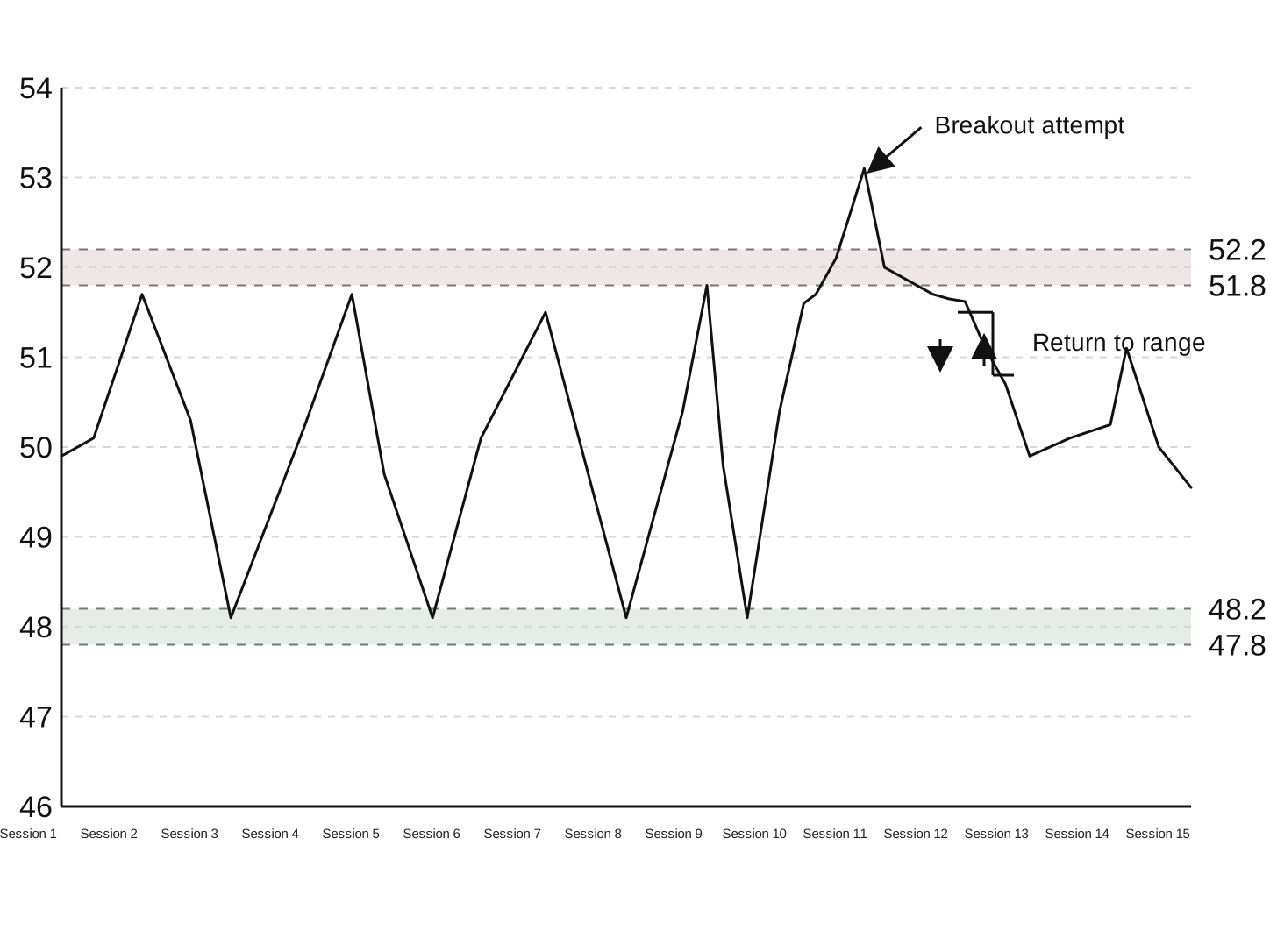
The final step is defining invalidation. Before calling something a breakout, a trend continuation, or a range reversal, state what would disprove the idea. This is how uncertainty is handled in a practical way. If price appears to break above a range but quickly falls back into the old range, the breakout reading weakens sharply. The market has not just moved beyond a level. It has failed to hold there.
A useful routine is simple. State the current structure. State the zone that matters. State what would invalidate the reading. Then avoid certainty words. Instead of saying price will break out, say that price is testing resistance and that a move beyond it only matters if the market can hold outside the zone. This keeps the chart in its proper role: a tool for organising observation and possible scenarios, not a machine for certainty.
Two quick examples
Uptrend example
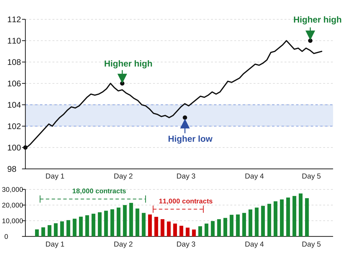
Suppose a daily chart rises from 100 to 106, pulls back to 103, then pushes to 110. Read left to right, that creates a higher high, then a higher low, then another higher high. On that timeframe, the chart supports a straightforward uptrend reading. The 102 to 104 area now deserves attention as support because the pullback found buying there rather than collapsing back to 100. If the rally from 103 to 110 also occurs with stronger participation than the pullback from 106 to 103, that adds context consistent with stronger participation on the advance than on the retracement. It does not prove continuation. If price falls back below 103 and cannot recover the zone, the immediate higher low has failed. If price then breaks below 100, the uptrend reading is no longer intact.
Range example
Suppose a one hour chart oscillates between 48 and 52 for several sessions. Price reaches the upper area around 52 several times and turns down, then reaches the lower area around 48 several times and turns up. That supports a range reading, with resistance around 51.8 to 52.2 and support around 47.8 to 48.2. If price trades to 52.6 for one bar but the next two bars fall back to 51.7 and then 50.9, the brief move above 52 looks less like successful acceptance and more like a false breakout. The important change is not the temporary push above resistance. It is the market’s failure to hold outside the established zone.
A practical checklist
Before you form a view, ask:
- What chart type am I using, and what does one bar represent?
- Which timeframe am I actually analysing?
- Is the dominant structure an uptrend, a downtrend, or a range?
- Where are the nearest repeated reaction zones?
- Is price near a boundary or in the middle?
- Is volume available, and what kind of volume is it?
- What specific event would invalidate my current reading?
Then check your own bias:
- Did I read the chart left to right before drawing conclusions?
- Have I marked zones rather than exact lines?
- Am I using a pattern name as description rather than prediction?
- Am I treating volume as context rather than proof?
- Am I describing what was visible before the move completed, rather than telling a neat story afterwards?
- If data feeds differ, have I narrowed my claim to what is common across venues?
A calm reading process is often better than a clever one. Timeframe first, structure second, zones third, volume after that, invalidation before conviction.
Treating a chart as a prediction tool instead of a record of price behaviour can lead to overconfident conclusions.
Ignoring timeframe can distort interpretation because the same market can look very different on a short intraday chart and a daily chart.
Drawing exact support and resistance lines can create false precision when repeated reactions often occur across a zone.
Using volume without understanding its source can be misleading because volume may be trade volume, consolidated volume, tick volume, venue specific volume, or unavailable.
Calling every move a breakout without defining what would invalidate that reading can turn ordinary price movement into hindsight storytelling.
Treating named patterns as guarantees removes the uncertainty that is still present in technical analysis.
Verified callouts
Support and resistance are zones, not precise lines
Support and resistance are best treated as price areas because markets do not usually reverse at exactly the same price every time. Official and industry education describe them as areas or levels where buying or selling interest tends to appear, and major levels are rarely exact figures.
Volume data can differ by market and venue
Volume is not one universal field across all charts. CME futures volume is defined as contracts traded across CME venues, US equity trade data may be consolidated across multiple exchanges, and chart platforms may show trade volume, tick volume, or no volume depending on the instrument and feed.
Chart patterns describe conditions but do not guarantee outcomes
Technical analysis is an interpretive framework based on price change, rates of change, volume, and related fields, not a guarantee that a named pattern will resolve as expected. Patterns are safer as descriptions of current conditions and possible scenarios than as promises.
Update log
- CME Group, Chart Types: candlestick, line, bar
- CME Group, Support and Resistance
- CME Group, About Volume
- CFTC, Futures Glossary
- NYSE, Consolidated Tape Association
- TradingView Help Center, The Volume indicator on my chart looks odd or displays zero (or n/a) values
- IG, Support and Resistance Levels Explained